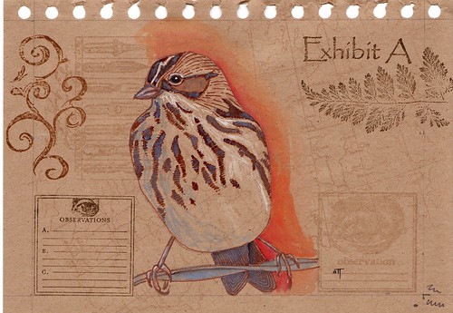
This is another sketch out of the Paperchase book. I was still experimenting here, with different inks and colors for the background, as well as for the drawing itself. I really like the layout of this one, but I'm not happy with the darker inks in the background design - I like the watermark look much better. I also am not very happy with using the sepia pen for the bird - I think I like the way the black ink plays against the strong colors of the gouache.
For sure, this birdie will be making an appearance in a finished piece - I like his saucy little attitude, balanced precariously on his wire, and his feet are fabulous...
edit: I picked up the Paperchase sketchbook at my local Border's bookstore for cheap. It's made of recycled kraft paper, wirebound, about 5 1/2 x 8 1/2. It looks similar to one of these, but it isn't exactly the same. I can't find it on the Border's website, and you can only order Paperchase online if you live in the UK.
Anyhow - the paper is plain brown, then I stamp it kind of randomly with an assortment of stamps...I like the look of the "watermark" ink best - it's basically clear ink that dries just a shade darker than whatever paper color you're working on.
Yet another gorgeous one!
ReplyDeleteWonderful art Diahn! We are definitely on the same 'bird' page today.
ReplyDeleteDid you put that background in or was it already on the paper? I like the effect it gives.
This is terrific!
ReplyDeleteI was wondering about the paper too. I really like that. What is a Paperchase book?
I think it's beautiful. I really like the gouache on tinted paper.
ReplyDeleteThanks, all! I'll add an edit in the post about the Paperchase sketchbook...
ReplyDeleteDiahn, I love your work! The gouache on the colored paper is great...and like the others, I am curious about it too.
ReplyDeleteThanks for leaving a comment on my blog.
I will stop by for another visit soon!
Well I think this is great!! I like the sepia - seems to work really well for this bird. The curlicue looks like a fantasy rendition of birdsong with all the little embellishments! All in all, it looks like a page from an old journal. Very effective!
ReplyDelete