Pages

Saturday, July 30, 2005

WDE 7.29.05


My first drawing for the WDE (weekend drawing event) at wetcanvas.com. There were a lot of good references this week, as usual, and I chose to start with "Ricco." I did this while watching the movie "Hitch" and laying in bed. It is about 6" square in my sketchbook - graphite pencil and prismacolor black. Posted by Picasa

Friday, July 29, 2005

Multi-cultural Revolution Take 2


Okay - maybe this time I finally have it. I darkened the background and the table top - then added in some light in the background. It comes across as a very light painting, though, I think - the background kind of drops away. I like how finished the apple is, as opposed to the pears - I think (hope) it draws attention to the apple, in it's poor lonely place. Posted by Picasa

close up of the pears Posted by Picasa

close up of the apple Posted by Picasa

I like it better - getting rid of the blue was key. I also refined the pears some and changed the table top. I am pretty happy with everything but the table. I am going to try and pull some of the green into the table top - more of a greeney-grey, maybe? I need to refine the shape of the apple when I am done, too - all that gesso takes it's toll on other objects! I'm also going to work on the shading for the forward pear - it's not quite what I'm wanting. It is amazing what shows up in a photo !
 Posted by Picasa

Wednesday, July 27, 2005


Well, just in the interest of honesty, I'm posting this. I'm pretty much not happy with it at all. I like the apple, and I like the cloth, but there aren't enough dark darks or light lights, I think - It's all too middle ground. I tried to make the pears really loose and full of thick brushstrokes, to offset the smoothness of the apple, and to make them appear a little garish and mocking. I don't think it worked :-( I'll be going back in and reworking them, proably making the wall behind the surface a little darker (?) and adding some more darks here and there...sigh. At least with acrylics, I have that option... Posted by Picasa

Tuesday, July 26, 2005

Multi-cultural Revolution


More work on the table and the cloth. I think they are done - now I can get to work on the pears and the apple. I'm liking that that upper pear is green, now - really makes the apple look out of place. Don't you just feel sorry for that poor little apple? Look - that pear is pointing at it...how rude! Posted by Picasa

Here's some progress. I decided to kind of unify the pears with a blue cloth (the actual one is unprimed canvas...yawn...) I'm liking it, but I think that the upper pear needs to be the same color as the two lower ones - makes the difference with the apple stand out more. I gessoed out the table completely - couldn't figure out what to do with it - I don't want it to complete with the red of the apple - it needs to be the focal point. I'm trying to not rush this one, as is my usual trend. I'd like to to really feel finished. I actually started this one with a plan - compositionally, if not color-wise, and I'm hoping to see it through! Posted by Picasa

Started a new painting today - a still life with some pears I got the other day. I had planned to just do the pears, but then I spied the apple in the fruit bowl and was inspired by a sermon I heard on Sunday. It was all about how easy it COULD be to spark a multi-cultural revolution, if only we were willing to speak to those we perceive as different from us. So - the pears and the apple...when it is finished, I think it will be obvious that the pears are all huddled up in their little like-minded group and the poor apple is sitting outside of the community just because it's an apple and not a pear. I thought that it was appropriate to use pears and apples, because really - they aren't that different from each other (not like apples and oranges, anyway) - at least not as different as they may appear surficially. I'm still thinking about the title, but a good working title might be, "You say hello...no - you...no - you..."  Posted by Picasa

Monday, July 25, 2005

Too Hot to Paint...


Man - it was hot today!! Heat index over 100 - acrylics dry just way too fast for that! Worked on a logo for a while, but I can't show it yet, and built and gessoed a couple of canvases after the sun went down - not much to photograph, there...white, square - that's really all you need to know. :-)

So - I'll give you a digitally manipulated picture I created a while ago ---gotta have some new art!!


This is an angel atop a tomb in Lafayette No. 1 Cemetery in New Orleans, Louisiana, digitally altered using Photoshop.

Saturday, July 23, 2005

Weekly Drawing Event 7.22.05


I painted this today in about 2 1/2 hours for the Weekly Drawing Event (WDE) at wetcanvas.com. Every Friday, a host posts a number of reference photos for everyone to choose from - you have ~30 minutes to choose a reference, then 2 hours to post something.

This is my first time to participate, so I was a little nervous at what I could actually produce in 2 hours, but I think it went okay. The colors are a little darker than I originally planned (and even darker in this image, unfortunately), but I think I learned a lot and had some fun! Posted by Picasa

Friday, July 22, 2005

Friday's Flowers


Not much to say today. The boys and I were cleaning out the garage, and we spotted this bumblebee pollinating our zinnias. I may just have to paint one of them! Posted by Picasa

Bumblebee on Pink Zinnia Posted by Picasa

Thursday, July 21, 2005


Up close and finished. Posted by Picasa

okay, I couldn't leave it alone. That smile line is okay now. whew. Posted by Picasa

Goal Number 1...NO GRID!


Well - here is my first attempt at goal number 1 for the week: "Achieve a likeness, with a reference photo, without using a grid." I did draw some reference lines on my reference photo, but not on my drawing paper. I'm pleased that at the outset, I've got everything basically in the right place! But, no one would recognize this as my son without the photo next to it - so there is some work to do! His face is too round...the space between the left eye (his right eye) and cheek is too wide, and his left eye is too open... Posted by Picasa

adjusted the left side and the hair, but the left (his right) eye is still too big and the left (his right) nostril is too low. Posted by Picasa

fixed eye and nostril, toned down some shading - maybe too much? Posted by Picasa

added some shadows and highlights, but something is still not right about that nose!! grrrrrr. Posted by Picasa

refining a little more - just noticed that the smile line on the left side is WAY off. Posted by Picasa

I fixed the smile line (mostly) I think this is a much better likeness than where I started - maybe even recognizable to others as my son. It was very interesting to post the wip - it is amazing how quickly I can spot mistakes after I take a photo and load it on my computer! This has definitely boosted my confidence in my drawing ability - I'll press on to goal number TWO...I guess I'll be spending a lot of time tomorrow in front of the bathroom mirror! Posted by Picasa

Enough, already!

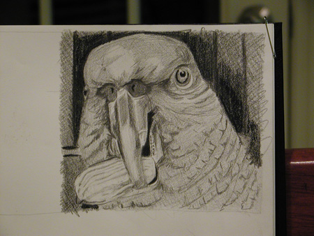
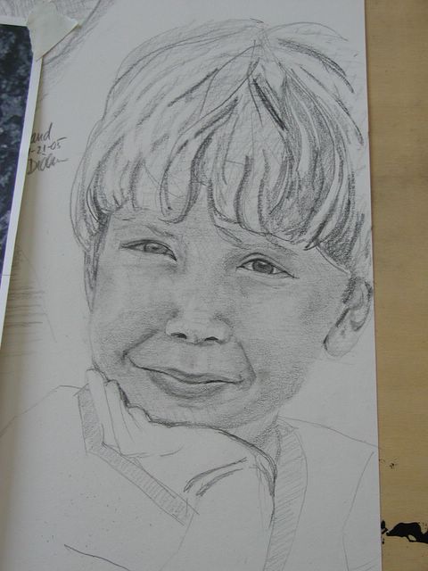
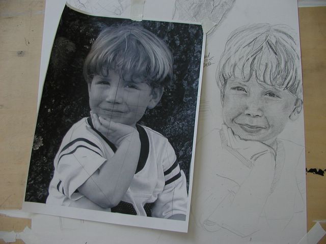
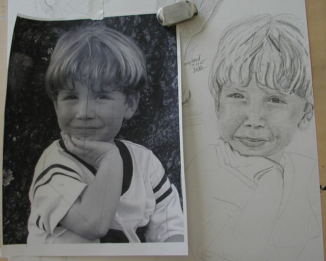
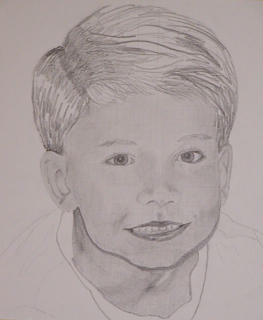
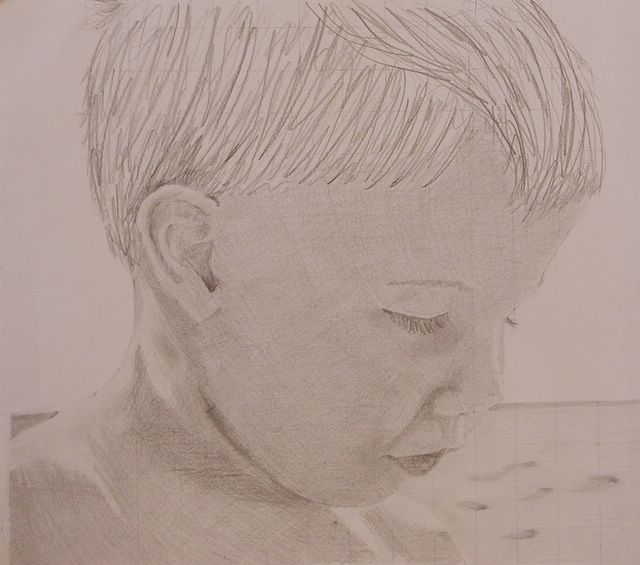
Well, I think I've learned everything I can from the grid system. I really just wanted to experiment with it, and see if it would help my eye see a little better. When it comes to creating a likeness of a person, I always seem to fall just a little short. This has been a really good exercise, though, and I feel like it will help alot.

So...with that in mind, here's what is going to happen next!! Today I'm going to wing it - drawing from a reference photo with no grid - just some placement lines to guide me. I may do one of the drawings I've already done with the grid, just to play it safe - not sure yet. But - here are my goals for the next week or so:

  1. Achieve a likeness, with a reference photo, without using a grid.
  2. Draw a self-portrait, from life, that is actually recognizable as me!
  3. Paint a portrait (self or otherwise) with realistic skin tones.
  4. Paint a portrait (self or otherwise) with varied color.

You know - even if no one ever reads this blog but me, having these goals to stick to is so good for me! Tune in to see what happens!!

Wednesday, July 20, 2005

Little guy...again


Evened out the shading on the face - still needs work on the lips, but it is getting better. Posted by Picasa

Portrait of the little guy


Here's the little boy again - in portrait mode. At this point, I'm still not happy with the shading - I have it too blotchy - that's easy to fix, though. I like his lips, but feel they are probably too dark and prominent - and I just can't figure out what to do with teeth - shape and placement is okay, but I think they need to be toned down a little. They eys are right on , though! Posted by Picasa

Big guy...again


I've gone back in and fixed a couple of the more obvious problems in this one - I think they eyes are more in relation to each other, and some of the harder shading on the face has been softened. Still not sure what to do about the lips - I think they are probably too dark, and that is what is throwing me off. I'm going to leave it alone for a day or two and see what I figure out about it. Posted by Picasa

Profile of little guy


One more for pencil. This is my youngest son in profile - at the beach. No, those eyelashes are NOT exaggerated! It's just not fair, is it girls? This one needs a little more work, blending and shading, but overall is good. LOVE those lips! Oh, and I'm mighty happy with that ear, too... Posted by Picasa

Portrait of the big guy


My oldest son, again, portrait-style. I'm happy overall with this one - form is good - resemblance is good. I'm not happy with the lips at all - the entire mouth is a little off. Part of it has to do with the angle - kind of down and off center - makes that left eye look a little big, too, but that's not unlike the real guy! Posted by Picasa