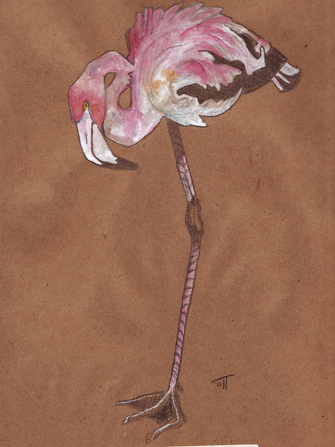
So this is the original sketch for the painting I posted on Thursday - I just transferred it to kraft paper and painted the pink and white parts with gouache, and left the blacks in pencil. I don't know why, but I like this more than the painting with the books. What do you all think?
See - here's what happens...I like to sketch kind of big, so I use a 9x12 pad to do my sketches, then shrink them down on the copier to whatever size fits my painting paper - in this case, the painting of Alice was 5x7, so there's quite a bit of size difference. Then, I get all fiddly and start drawing in individual feather lines - WHICH I LIKE - but sometimes I feel like the freshness of the original sketch gets lost in the process of making a completed painting.
sigh.
One day I'm going to be satisfied with what I do, I think. Really.
While I love the softness of this flamingo, I'm crazy about the color and detail in the feathers of the first flamingo. And the vibrant stack of books with clever titles...reminds me of you! It's all in the eye of the beholder, both are beautiful, but I love the personality and playfulness of the first painting. An art critic, I'm not. :) But you DID ask...
ReplyDeleteDifferent styles - both excellent. I can't make up my mind which to like better. Each stands on its own, er, leg.
ReplyDeleteI really like this on the kraft paper, the color and the texture of the paper work great with the colors you chose for the details. Beautiful work as always!
ReplyDeleteIt's like saying, "what do you like better, chocolate or vanilla ice cream?" They're all good.
ReplyDeleteBut I still favor the books.
As far as ever being satisfied with your work, it remainds me of my daughter, art student, who is never quite happy or finished with a painting. Must be an art thing.
I like them both. Both evoke different responses. Both are very good. One is soothing and one is vibrant. Yep, I like 'em both.
ReplyDeletePurely in the eye of the beholder, but for me the one on kraft paper is the winner. I like the expressively loose, sketchy lines still evident beneath the gouache, the application of the paint, the line work and details--but 'less is more' for me. The curl of the neck, and the colors used there and in the wing are most intriguing! :)
ReplyDeletewell....honestly i think both are pretty in their own way.....but i like the previous one better!:)...grt job however.....and HEY! i like your blog.....givin u a follow;)
ReplyDeleteYou've said it..."the freshness of the original sketch gets lost in the process of making a completed painting." Ahhhh....I find this to be the case so much of the time!!!!! In an effort to make it 'perfect' the repeat performance loses some spirit. Now, how do we avoid this?!?
ReplyDeleteI LOVE this one. The gouache on the kraft paper is perfect!
Haha...verification word : nesty!