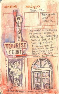
 Linda and I headed out yesterday on a mini-sketchcrawl around Homburg in Knoxville. We had great plans to work our way from there downtown, but we made it about 2 blocks. I think it was the impulse field trip to Jerry's Artarama that slowed us down! How convenient that it was just down the street from where we started! It was a great opportunity for me to pick Linda's brain on all things watercolor, though - I even picked up my very first piece of 22x30 watercolor paper, along with the instructions on how to wet and stretch it!
We started at The Orangery, which I had always thought was just a swanky restaurant in a cool building, but which turns out to be a shopping center of sorts - spas and interior design houses and art galleries. It is a beautiful building with a lot of character and what seems like alot of history - but with a little investigation by my DH, we found out that is the brainchild of a local design guru who built it in the 70s. Sigh - beautiful, but not so historical. But - it was pleasant and we had a nice time in hidden alcove sketching the little cherubs that line the crown mouldings.
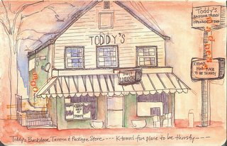
After Jerry's, we stopped across the street from Toddy's, billed as Ktown's fun place to be thirsty. Seemed a little ironic to me - I think a tavern and liquor store would be more like a fun
 place to quench a thirst... My DH saw this one and said "Toddy's?" with a kind of funny look - like, why would you draw Toddy's? (Which is apparently pronounced "Toad-ees") It's a cool building - had character - so what if it's a seedy little bar?
The Biltmore sign in the top page is across from Toddy's. I didn't see the tourist court anymore - probably torn down like a lot of old buildings that seem to have no further use. Linda noticed a house that had been torn down on one of the corners - making way for another upscale designer shop, I'm sure. How did we turn into a society of disposable buildings? We just don't recognize the value in old and interesting architecture (she says with a smug look as she prepares to go paint the walls in her new box like cookie cutter house that's being built even as we speak...)


Fun, fun, fun!
ReplyDeleteThese are excellent! I love the tinted paper, the lettering and the subject! Nicely done!
ReplyDeleteBelinda
These are wonderful. Sounds like you and Linda had a great time.
ReplyDelete